August 20, 2024
Rebranding Royal Flowers
The Perfect Blend of Tradition and Innovation
Revamping a brand’s identity is never a simple task. People hold brand visuals close to their hearts, and as creatures of habit, they often find it challenging to embrace change. However, every brand evolves, and there comes a time when its personality no longer aligns with its visual identity—this is when a redesign becomes essential. For Royal, the original logo reflected tradition with its sans-serif fonts and literal iconography. However, since I joined as Creative Director in 2021, I’ve guided the brand toward a more immersive visual retail experience, requiring the logo to evolve accordingly.

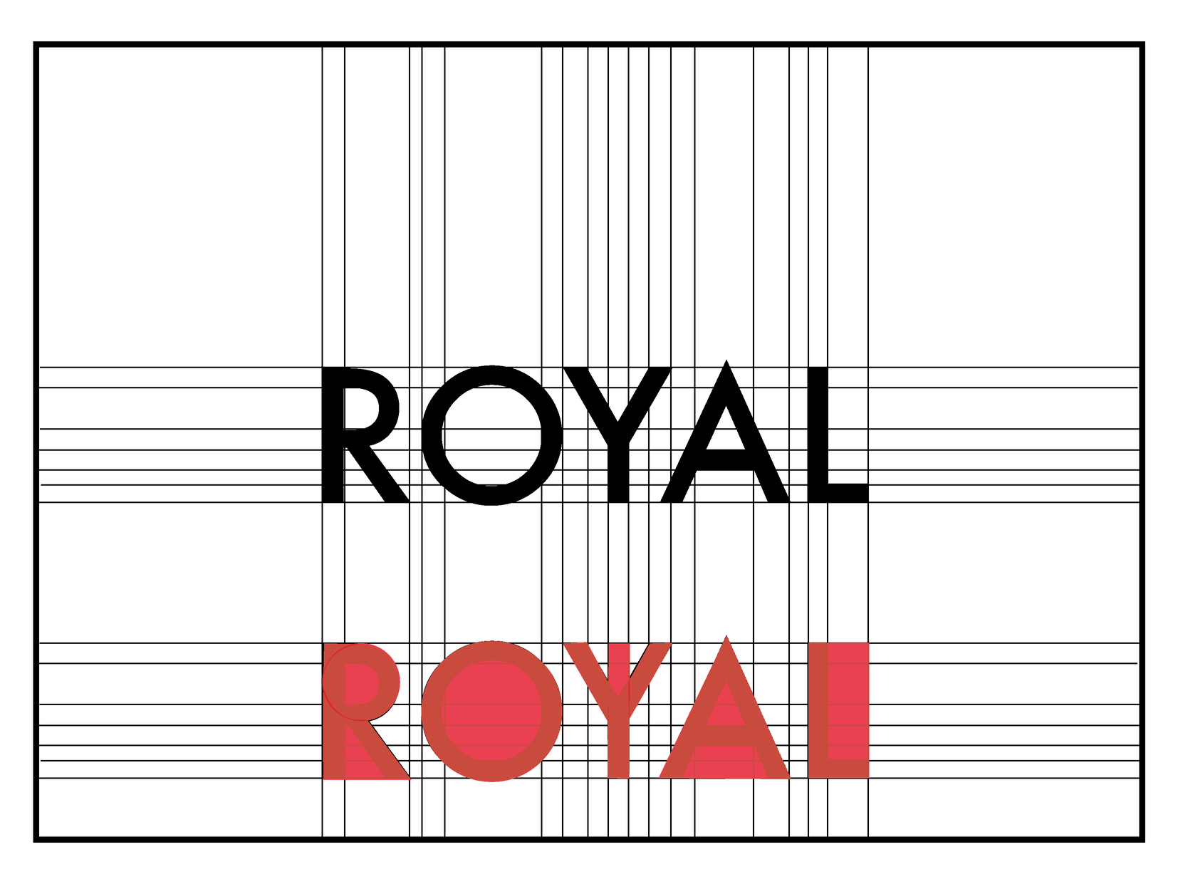
This evolution led us to explore bold typography that is sharp, angular, and commanding—fonts that maintain a timeless quality while merging traditional elements with a cutting-edge aesthetic. The right typography can make a profound difference. We needed something assertive, eye-catching, and unforgettable, something that commands attention with simplicity.
That’s when we discovered a typeface that goes beyond just being bold—it embodies confidence and assertiveness with its balanced horizontal and vertical letterforms. Whether on a gigantic billboard or a small watch, it remains legible and impactful. This new logo marks a fresh point of interaction between our audience and the brand, conveying reliability, versatility, and strength.
How do you find a worthy successor to a beloved icon? In our case, it was more of a necessity than a choice. As the brand evolved, the existing icon—designed with curves and a Victorian influence—began to feel outdated. After a six-month journey of trial and error, we discovered an intricate combination of letters that felt simple yet memorable. We started by flipping the initials of Royal Flowers and merging them to create a versatile pattern. No matter the angle, the “RF” initials are visible, making it instantly recognizable to our audience.
After finding the right combination and size, we perfected the balance and composition to avoid a cluttered look. By adding inclined vertical and horizontal lines, the new monogram was born. It represents the endless dedication of our team and is supported by a strong visual DNA that stands the test of time.
Typically, a monogram has a lifespan of around ten years. With our updated logo, we needed an icon that matched the brand’s personality. This new monogram, we believe, will remain relevant for years, versatile enough to be used creatively in various applications.
COLOR: NOT PURE RED BUT ROYAL RED
Color plays a crucial role in the brand’s evolution. For Royal Flowers, red is as essential as a double shot of espresso—it’s a color deeply embedded in people’s minds and is inherently eye-catching. While red was a must for the brand’s reimagination, the pure red paired with black posed a challenge when combined with the new fonts and monogram. The goal was to enhance the boldness without letting the color compete with the other elements.
We started with the basics, realizing that white should be our canvas. Like all art forms, white allows for expression to flourish, making it our initial choice. Next, black, part of our brand DNA, became the perfect contrast to the white canvas, commanding attention with its traditional simplicity. The final touch was finding the perfect shade of red—a color that exudes sophistication without falling into the cliché of love or awareness. Through color testing, we discovered a unique shade reminiscent of a French red burgundy wine, with hints of orange and a soft touch of brown. We call it Royal Red—a sophisticated hue that blends warm, earthy tones with just the right amount of boldness.
INFLUENCE: ARCHITECTURE AND PHOTOGRAPHY
At the core of our brand is a strong DNA: the perfect fusion of traditional 90s black-and-white fashion ads with a retail philosophy that lets the colors of our roses shine against a black-and-white backdrop. The presentation of classic bouquets represents timeless elegance and simplicity. Architecture, in particular, has been a significant influence on this project. Through our exploration of old books, we drew inspiration from stucco facades, black accent lines, terrazzo floors, and white plastered walls.
This harmonious blend of tradition and contemporary design was central to creating the new logo and monogram, where the visual narrative intertwines Royal’s rich history with a modern aesthetic, allowing our products to take center stage.


